Case Study
Ultium App
Defining the visual language for General Motors new EV branded experience.

Overview
Ultium is General Motors new electric vehicle brand and platform. The task was to design a stand alone branded mobile app to support the electric vehicle charging experience for our user.
Research showed fear of electricity is a major hurdle for our EV user. Instilling confidence was a major goal when it came to helping the user set up and manage their charger. All decisions were made with that in mind.
Roles & Responsibilities
Lead Visual Design
Figma Design Library
UX Design Support
Benchmarking
Brand Design
Motion Design Direction
Development Support
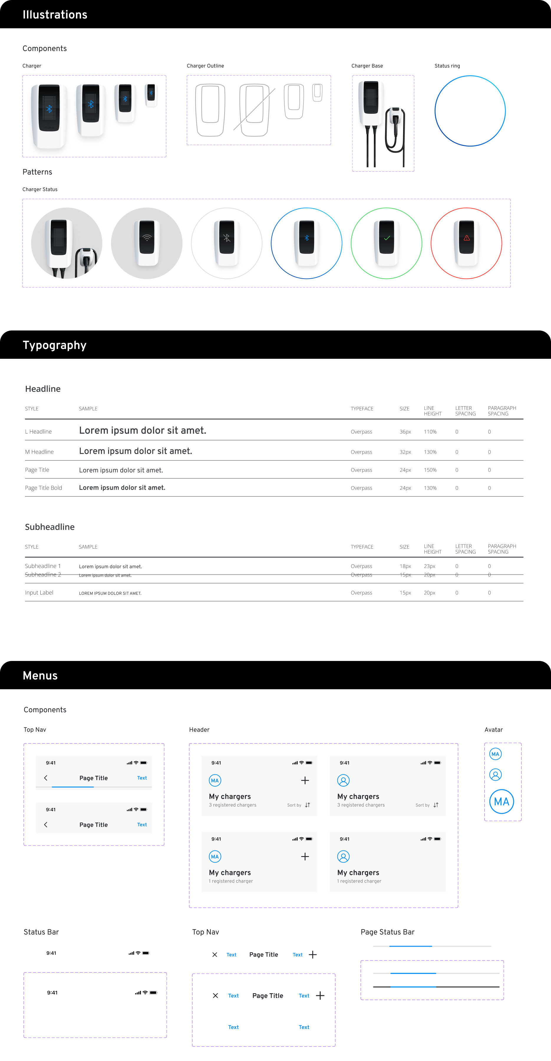
Iconography & Illustrations

Key Takeaways
Design Systems
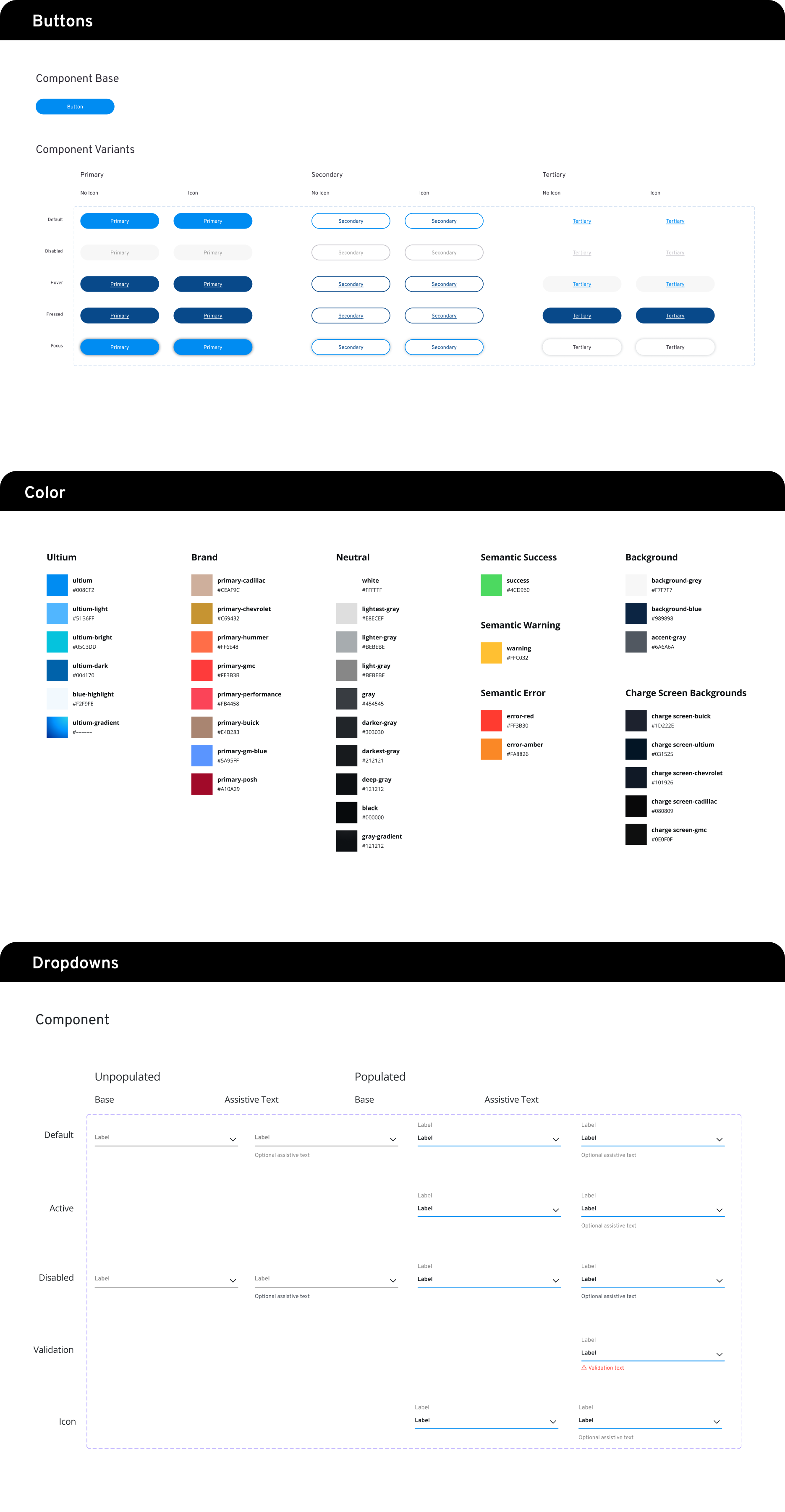
I defined the first Utlium branded experience with an extended design library featuring new and unique components and patterns.
Collaborative Design
A collaborative cross-discipline approach was necessary for our user due to the complex ecosystem of EV products they encounter.
01
Ultium Styling
Styling was defined by leveraging the General Motors recent brand refresh and then making adjustments for our unique electric vehicle user. Ease of use and accessibility standards were two main themes with the execution. Simplicity in form and function were key to delivering an experience that not only looked the part, but also helped the user engage with their new EV with confidence.


02
Design System
I designed and maintained the Ultium core design library in Figma. Each element was built leveraging Figma’s auto layout tool allowing for responsive design behavior in frames and in layout.
Components
Banners
Buttons
Dropdowns
Icons
Illustrations
Keyboards
Notifications
Progress Bar
Status Bar
Patterns
Brand Tiles
Charger Tiles
Dialogs
Lists
Menus
Snackbars
Tags
Foundation
Breakpoints
Breakpoint Grids
Color Palette
Elevation
Spacing & Grids
Typography
03
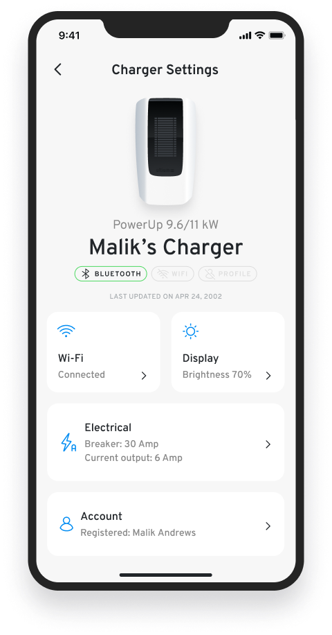
Interface Design
My goal was to define a delightfully intuitive visual design language that felt like an extension of the General Motors brand. Leveraging simplicity in form, color and pattern was key to styling an interface that would have universal appeal.
Below are a few key screens from the experience. Each design represents one of many screens designed for that feature. My approach for this UI was rooted in design fundamentals – the use of scale, color and negative space specifically.
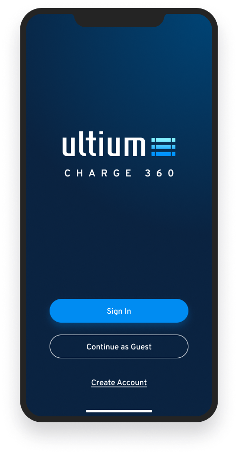
Splash
Launcher
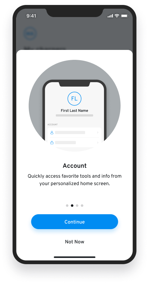
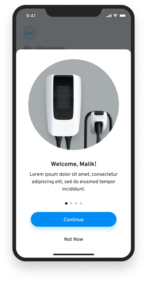
Onboarding
Loading States
Home States
Dashboard
Product Sorting
User Account
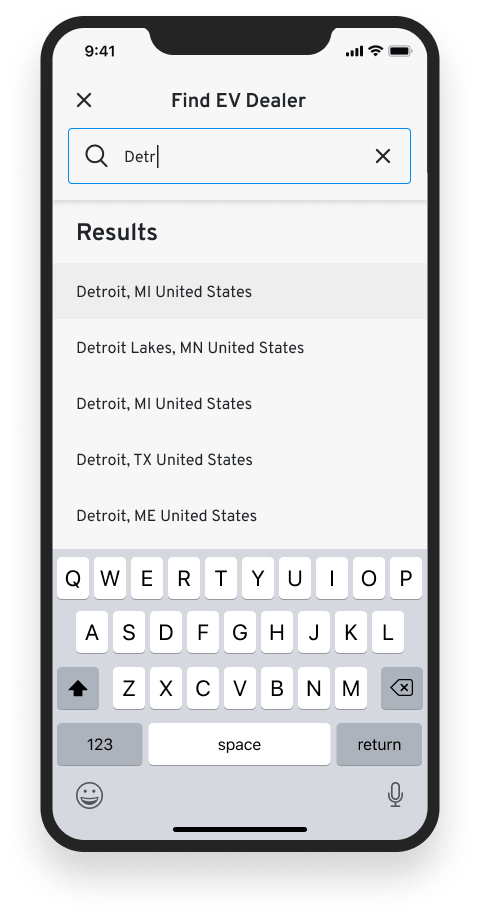
Locate a Dealer
Charger Setup
Authenticated Account
Guest Mode
1 / 4 Onboarding

2 / 4 Home States


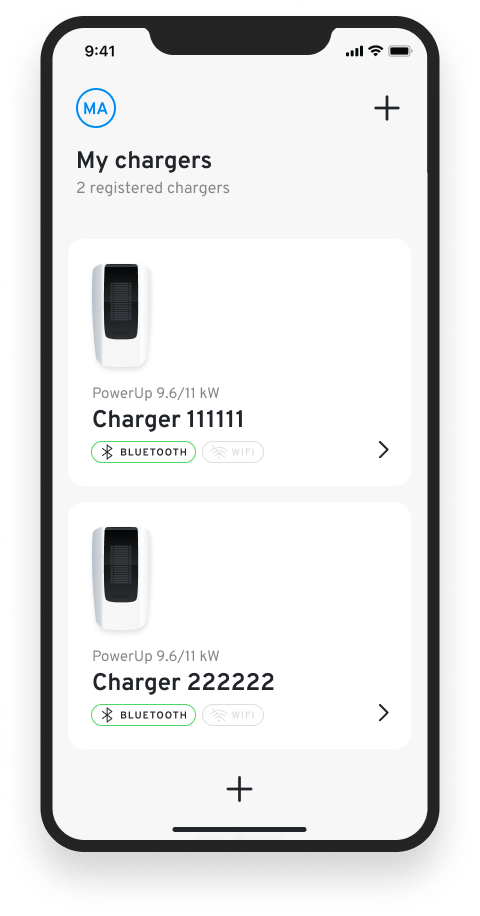

3 / 4 Charger Setup


4 / 4 Find a Dealer